Repositioning Studio Organic from a broad marketing and creative offer into a clearer strategic brand practice — aligning the business, audience and identity around the work we actually wanted to be known for.
Category:
Brand Strategy & Identity
Client:
Studio Organic
Duration:
2019–2025
Location:
Norway

Studio Organic had evolved, but the way we presented ourselves had not.
The name Organic Marketing increasingly created the wrong expectations, with potential clients often assuming we focused on paid advertising and promotional services. In reality, the business had moved toward strategic branding, identity, sustainability and long-term brand development.
The visible problem was the brand. The deeper problem was alignment: our name, offer, audience and market perception were no longer telling the same story.
The challenge was therefore not simply to create a new identity. It was to define what kind of studio we wanted to become, which problems we wanted to solve, and how the brand could support that direction over time.
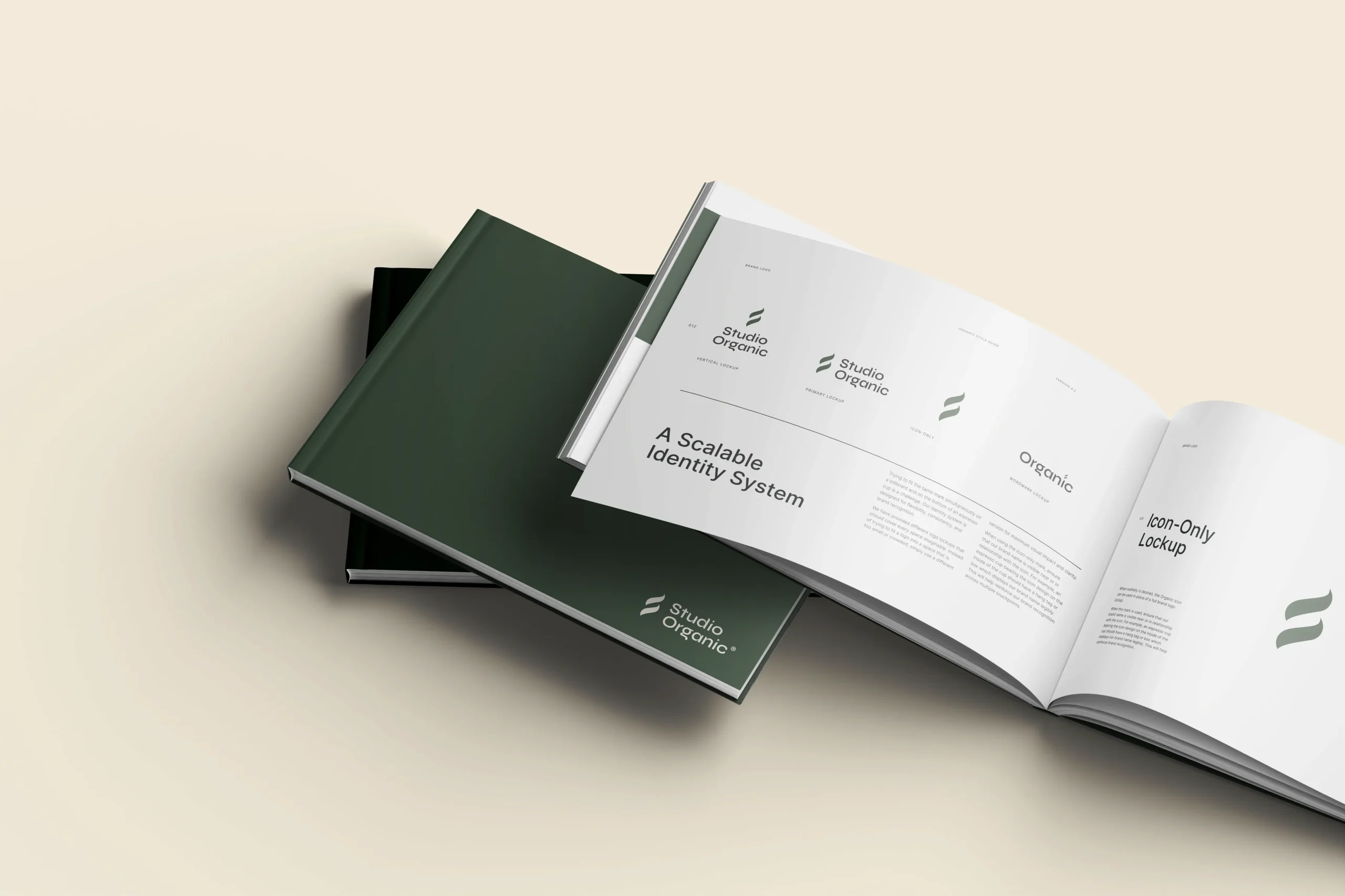

I translated the strategic direction into a complete visual and verbal identity system.
The new name, Studio Organic, removed the misleading association with paid marketing while preserving continuity with the business we had already built.
The identity centred on a spiral-inspired symbol representing movement, growth, adaptability and interconnected systems. Its structure also subtly references the letter “S”, creating a recognisable mark without relying on an obvious monogram.
The visual system combined Syne for expressive headlines with Inter for clarity and utility, supported by a restrained palette of Moss Green, Muted Terracotta and Ivory. The intention was to balance structure with warmth — strategic without feeling corporate, and creative without becoming decorative.
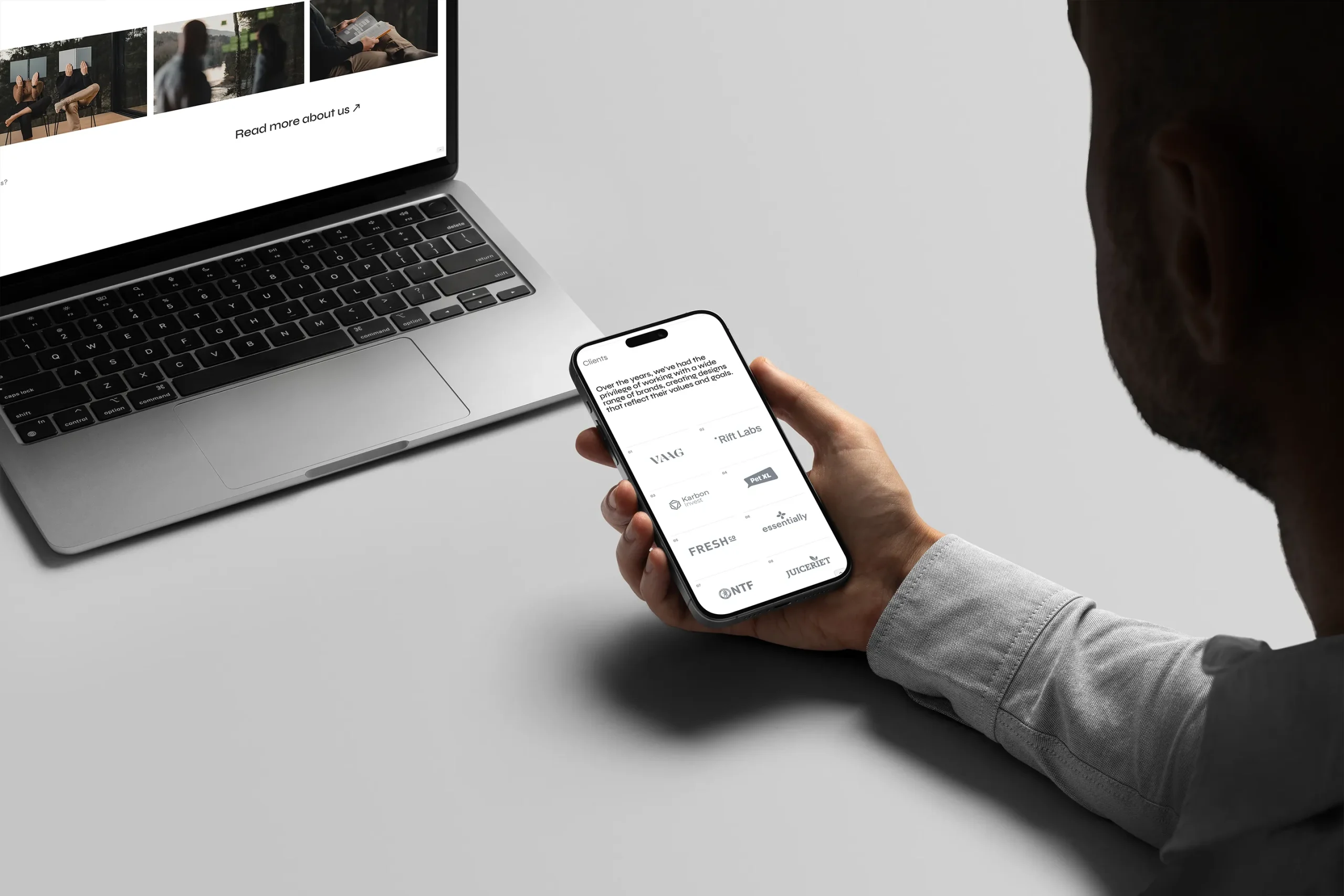
The system was applied across the website, social channels, marketing material and print. The digital experience was developed with speed, accessibility and lower-impact infrastructure in mind, so the operational choices behind the brand supported the same principles communicated externally.
The repositioning brought the business, offer and identity back into alignment.
Following the rebrand, inquiries from environmentally conscious businesses increased by approximately 40%, while the studio attracted stronger-fit conversations and expanded its work with sustainability-led brands.
More importantly, the new brand became a practical decision-making tool. It gave us a clearer way to evaluate clients, projects, communication and future opportunities instead of treating the identity as a finished design asset.
The project reinforced something I still believe: when a brand no longer reflects the business behind it, changing the visual identity is not enough. The business, position and experience have to move together.
+40%
Relevant inquiries
Increase following repositioning